Categories
Uncategorized

[Slideshow] – Responsive Web Design: How the mobile web has changed the way we think and work.

On April 16th, Nick Weaver (@nickweaver) and I gave a presentation at the Madison Web Design & Dev Meetup titled “Responsive Web Design:  How the mobile web has changed the way we think and work.” We were pleased to bring such a cool topic to this meetup led by Ben Siegel, Principal at VersaStudio, LLC.

The presentation was an introduction to Responsive Web Design (RWD), a new approach to web development brought forward and popularized by Ethan Marcotte. We covered the benefits and challenges of RWD and the pros and cons of native vs web-based applications for mobile.

Below is a link to the presentation’s slideshow. Enjoy!

Categories
Uncategorized

Optimizing your web application: Mobile UI performance considerations

In her article Mobile UI performance considerations, Estelle Weyl addresses memory and battery considerations when developing web applications for mobile devices. From embedding CSS and JavaScript into your HTML file (GASP!!!) on first load (and storing the code using localStorage), to minding the DOM and what you CAN’T see in the viewport of a mobile phone, this article is full of great ideas on how to reduce loading and processing times on our beloved tiny devices. A must read.

Get it here -> http://calendar.perfplanet.com/2011/mobile-ui-performance-considerations/


Categories
Uncategorized

“When can I use…”: a CSS compatibility reference

Ever wonder when you can use the CSS rule inline-block, or PNG transparency, and what browsers support them? Search no more: http://caniuse.com/ has a cool list of these and other rules. Happy to have found it!

Categories
Uncategorized

Web Dev tool of the week: JSFiddle.net

After seeing it featured in several articles as a tool for live examples, I can only say that JSFiddle is a dream come true: an experimental environment where you can test your HTML, JavaScript and CSS and see the results right there. You can even choose a framework to work with (jQuery, Mootools, Prototype) and start coding away.

Highly recommended. I’ll definitely be using it to test during development!

Get your hands on it: http://jsfiddle.net/

Categories
Uncategorized

How to use CSS sprites to create custom bullets in HTML

When creating unordered lists (i.e. the ones with bullets and not numbers or letters) in HTML, you can use the list-image CSS property to use an image to replace the default bullets HTML supports.

That’s cool. But, if you are mindful of front-end optimization and decide to use CSS sprites throughout your site to reduce HTTP requests,  the list-image CSS property falls short, because it is intended to use only one perfect, well-tailored bullet image for each bullet style you define. So, if you have ten different types of lists with different image bullets, you will need as many or more separate images to customize your lists. And that is NOT cool.

So, how do you use CSS sprites to create custom bullets?

Example

First, here is the demo of the bulleted list with custom bullets made using CSS Sprites we’ll be developing in this example. A few things to notice:

  • The bullets are made of custom images contained in a CSS sprite.
  • The bullets change on hover from gray to red, just like each link does (something not accomplished by default when only using the a:hover CSS property).

Now, let’s get to it.

What you need:

The HTML

This is the basic HTML we’ll use for this example, which creates a list of links to awesome tropical flavors:

<ul id="my-list">
	<li><a href="#">Mango</a></li>
	<li><a href="#">Banana</a></li>
	<li><a href="#">Watermelon</a></li>
</ul>

The CSS

This is the initial CSS we’ll use in this example. We’ll develop it more as we go along:

#my-list{
	width: 120px;
	padding: 16px;
	border: 1px dotted #CCC;
}

#my-list a{
	display:block;
	padding: 4px 0;
	color:#333;
	text-decoration:none;
}

#my-list a:hover{
	color:#900;
}

#my-list li{
	margin: 0 0 0 12px;
}

The HTML and CSS above generate a list that looks like this:
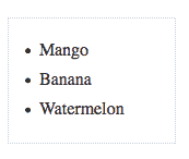
The custom-bullets sprite image

Ok so, what’s are CSS sprites, again?

In a few words, CSS sprites are basically images that contain a grid of images, like this one from Google. The idea is that instead of loading each image separately, you can load a master image that contains them all, and then use that master image as a background in all HTML elements that need it. This helps reduce the amount of HTTP requests your page makes on load, which then helps reduce loading times. A List Apart has a seminal article on CSS Sprites that, despite being old, will still blow your mind. Also, Christ Coyier from CSS-tricks.com has a cool article with more info on how to use sprites with an example from his own website. Read it.

Here’s the image very simple image sprite we’ll use for this example:

Getting it done:

Let’s further expand the CSS above to make this thing work:

  1. Remove the “bullets” from each li element
#my-list li{
	margin: 0 0 0 12px;
	list-style:none;
}
  1. Remove the left margin and  some the same amount in padding. This helps both make up for the space lost when the bullets were removed and open some space between the border of the li element and the anchor element contained in it
#my-list li{
	list-style:none;
	padding: 0 0 0 12px;
}

At this point, the list should look like this:
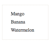
  1. Set the sprite as the background for the li element
#my-list li{
	list-style:none;
	padding: 0 0 0 12px;
	background: url(images/sprite.png) -8px 0px;
}
  1. Set the background for the :hover of the li element
#my-list li:hover{

background: url(images/sprite.png) -8px 24px
}

Notice that the list element is now using the sprite image as its background, but it repeats all over the place:
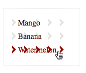
There are two ways to solve this, depending on how your sprite is set up:

  1. a) If your sprite is setup vertically (i.e. if all the images in the sprite are stacked in one column), you can do with just setting the background-repeat to repeat-y at it will do the trick:
#my-list li{
	list-style:none;
	padding: 0 0 0 12px;
	background: url(images/sprite.png) -8px 0px repeat-y;
}

#my-list li:hover{

	background: url(images/sprite.png) -8px 24px repeat-y
}
  1. b) If your sprite is setup horizontally (i.e. if all images in the sprite are distributed across the grid, next to each other, like the one in the Googlee example shown above), you may be better off by setting up background color for the most immediate element contained in the li element (in our case, the <a> element):
#my-list a{
	display:block;
	padding: 4px 0;
	color:#333;
	text-decoration:none;
	background-color:#FFF;
}

Whichever the case, your list should now look like this:
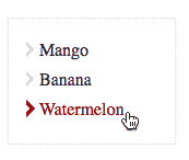
And that’s it! Click here to see the live example »

See you next time!

Categories
Uncategorized

How to center divs within a page with CSS

Sometimes you may want to center a div element within a page, whether vertically, horizontally, or both (dead center). Here’s how  you can accomplish all of that using CSS.

What you need:

The HTML

For this example, we’ll use the following HTML code:

<div id="container">
<p>Some content goes here.</p>
</div>

The CSS

The basic formatting for the #container element will be:

#container {
border: 1px solid #000;
background-color: #69C;
padding: 8px;}

Getting it done:

How to center a div element horizontally

To center a div element horizontally you need to:

  1. Set its left and right margins to auto,  which will automatically set the margin space on both sides of the div element, centering it within the page.
  2. Declare the div element’s width to override the default width: auto property, which makes div elements be as wide as their containers .
Here’s the CSS:
.center_horiz{
 width: 158px;
 margin: 0 auto;
}

See example here

How to center a div element vertically

To center a div element vertically vertically within a page, you need to:

  1. Set the position of the element to absolute, so it uses the height of the page as reference.
  2. Set the top property to 50%, so the div element moves down to the middle of the page
  3. Use the margin-top property to move the div element a little bit above the middle of the page (if you need to).
Here’s the CSS:
.center_vert{
 position: absolute;
 top: 50%;
 margin-top: -35px;
}

See example here

How to center a div element both vertically and horizontally (dead center)

To place a div element dead center within a page, you can use the same technique as when centering it vertically and apply it to center the div element horizontally as well. To accomplish this, you need to:

  1. Set the position of the div element to absolute, so it uses the height and width of the page as reference.
  2. Set the top and left properties to 50%, so the div element moves down and to the center of the page.
  3. Use the margin-top and margin-left properties to move the div element a little bit above and left of the middle of the page (if you need to).
Here’s the CSS:
.dead_center{
 position: absolute;
 top: 50%;
 left: 50%;
 margin-top: -35px;
 margin-left: -85px;
}

See example here

And that should be it. See you next time.

Categories
Uncategorized

How to load CSS stylesheets dynamically with jQuery

Sometimes you may want to load a CSS stylesheet dynamically after your HTML page has loaded and certain conditions are met (for example, if an element with a specific class exists in the DOM). jQuery can help you accomplish that with only a few lines of code.

How to get there:

The HTML:

For this example, let’s say we need to load a stylesheet to format a div tag in the following HTML code:

<html>
<head>
<title>jQuery - Load CSS</title>
</head>
<body>
<div id="container" class="class">
<p>This is a div tag that was formatted using <a href="http://www.jquery.com" alt="Link to jQuery.com">jQuery</a>
</p></div>
</body>
</html>

The CSS:

This will be the CSS code in our sample stylesheet, “style.css”:

#container{
   border: 1px solid #000;
   background-color:#EEE;
   padding:8px;
   margin:8px;
   width: 200px;
}

The jQuery:

These are the jQuery functions we’ll use to get this done:

  • $() wrapper: as the main and most powerful jQuery function, we’ll use it to:
    • Execute code once the document has been loaded
    • Determine whether the #container div element exists in the DOM and, if true,
    • Create new HTML to link the style.css stylesheet to our page
  • append(): this jQuery function allows you to append new HTML code to any element in the DOM. For this example, we’ll attach a new <link> element to the <head> element of our document.

Bringing it all together:

With our HTML and CSS files in place, let’s get this done:

Load jQuery

  • Add the following code between the </body> and </html> tags in your HTML document (Note: your actual path might be different than the one on this example, depending on where your jquery.js file has been stored)
<script type="text/javascript" src="../jquery-1.4.2.min.js"></script>

Add the jQuery code

  • Right under the last line, add the following code:
<script type="text/javascript">

$(document).ready(function(){ //Once the document is ready, run the following code

   if($("#container").size()>0){ //Check if at least one element with the id "#container" exists within the DOM

      $("head").append($("<link rel='stylesheet' href='style.css' type='text/css' media='screen' />")); //if true, append the new <link> element to the <head> element in oor HTML page    }
});

</script>


* * * UPDATE * * *

Domenico Testa pointed out that the approach above doesn’t work correctly in IE. IE needs the  document.createStyleSheet() function to attach new stylesheet after loading the page:

document.createStyleSheet('style.css');


So, the final code should be:

<script type="text/javascript">
	$(document).ready(function(){

	if($("#container").size()>0){
			if (document.createStyleSheet){
				document.createStyleSheet('style.css');
			}
			else {
				$("head").append($("<link rel='stylesheet' href='style.css' type='text/css' media='screen' />"));
			}
		}
	});
</script>

View example here »


And that should be it. This technique is useful if your page has loaded and you want to load extra CSS files when certain elements exist in the DOM. This can help you save some bandwidth and make your page load faster.